Before understanding what is WGCNA, we first need to understand what is a network. Networks are particularly valuable for data integration. For example, genes with different expression values could build a gene-gene similarity network, where the genes with similar expression values should be grouped in adjacent position.

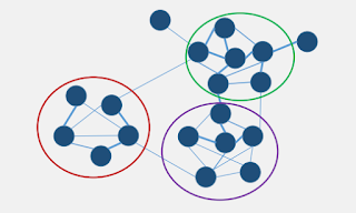
We could further analyse the network by relating different clusters of genes with their most relevant trait information. For example, the green cluster is more related to the weight and glucose level.


All these could be done by WGCNA analysis.
WGCNA is a type of analysis that used to correlate disparate data sets, such as SNPs, gene expression, DNA methylation, clinical outcomes etc. The central hypothesis of WGCNA is "genes with similar expression patterns are of interest because they may be tightly co-regulated, functionally related and members of the same pathway".
Before creating a WGCNA network, one has to create the modules (same definition as "cluster") for the dataset. This can be done by running a clustering analysis on the normalised dataset, often the combination methods using average linkage hierarchical clustering coupled with the topological overlap dissimilarity measure. Modules are defined as branches based on the resulting cluster tree (using dynamic tree cutting method), which either labelled by integers (1,2,3...) or equivalently by colors (turqoise, blue, brown, etc).
Okay, these seems too much of jargonised terms. But firstly, we could divide the workflow into 4 parts:
1. Data preparation
2. Weighted correlation network of genes
- Selection of soft thresholding power and module detection
3. Correlation of modules with external traits and identification of potential "driver" genes
4. Visualise the network
R script explanation:
1. Data preparation
####Set directory
getwd() #to know what is your current working directory
workingDir = "C:/Users/Lynn/Documents/WGCNA" #set this as your working directory
setwd(workingDir) #run the code "setwd" to direct R studio into this working environment
####load the library
# The following setting is important, do not omit.
options(stringsAsFactors = FALSE);
####Read sample data in its file format
FEMP_geneexp = read.csv("AllGene_FEMP.csv")
order(FEMP_geneexp, decreasing = TRUE) #arrange the expression dataset in descending order
FEMP_geneexp <- FEMP_geneexp[1:10000,] #choose only the first 10k row
datExpr0 = as.data.frame(t(FEMP_geneexp[,-c(1,10:16)])) #choose the target columns for this analysis, remember to transpose the dataframe to make the rows as the samples and the columns as the 10k of gene list.
names(datExpr0) = FEMP_geneexp$ï..gene_id; #name the 10k of gene list, before this step, the first row of the dataframe is just labelled as 1,2,3...but now they are with the unique ID from the original csv file.
rownames(datExpr0) = names(FEMP_geneexp)[-c(1,10:16)]; #trim the dataframe so that it contain only the rows with integer only.
####normalise the dataframe
datExpr0 <- scale(datExpr0) #scale function is very useful to change the integar ranged from 0 to 1.
##Check if there are genes with missing values
gsg = goodSamplesGenes(datExpr0, verbose = 3);
gsg$allOK #if this return TRUE, all genes have passed the cuts. If not, we remove the offending genes and samples from the data
if (!gsg$allOK)
{
# Optionally, print the gene and sample names that were removed:
if (sum(!gsg$goodGenes)>0)
printFlush(paste("Removing genes:", paste(names(datExpr0)[!gsg$goodGenes], collapse = ", ")));
if (sum(!gsg$goodSamples)>0)
printFlush(paste("Removing samples:", paste(rownames(datExpr0)[!gsg$goodSamples], collapse = ", ")));
# Remove the offending genes and samples from the data:
datExpr0 = datExpr0[gsg$goodSamples, gsg$goodGenes]
}
####Sample clustering
####cluster the samples to see if there are any obvious outliers
sampleTree = hclust(dist(datExpr0), method = "average");
# Plot the sample tree: Open a graphic output window of size 12 by 9 inches
# The user should change the dimensions if the window is too large or too small.
sizeGrWindow(12,9)
#pdf(file = "Plots/sampleClustering.pdf", width = 12, height = 9);
par(cex = 0.6);
par(mar = c(0,4,2,0))
plot(sampleTree, main = "Sample clustering to detect outliers", sub="", xlab="", cex.lab = 1.5,
cex.axis = 1.5, cex.main = 2)

#####Remove outliers from data (but I have skipped this part because obviously no outlier. If you need to perform this step, you can modify the following script for your own case)
##### Plot a line to show the cut
abline(h = 15, col = "red");
##### Determine cluster under the line
clust = cutreeStatic(sampleTree, cutHeight = 15, minSize = 10)
table(clust)
##### clust 1 contains the samples we want to keep
keepSamples = (clust==1)
datExpr = datExpr0[keepSamples, ]
nGenes = ncol(datExpr)
nSamples = nrow(datExpr)
2. Weighted correlation network of genes
- Selection of soft thresholding power and module detection
This is the first important analysis in WGCNA.
The distance between the genes are calculated using several types of correlation method suitable for different dataset:
a. Pearson - cor(x)
- Default correlation method in WGCNA, use it when there is no outliers
- Fastest, but sensitive to outliers
- It is also a standard measurement of linear correlation
b. Spearman, Kendall - cor(x, method = "spearman")
- Rank-based, works even if the relationship is not linear
- Less sensitive to gene expression differences
- Can be used as-is for correlations involving binary/categorical variables
c. biweight midcorrelation - bicor(x)
- Robust
For every pair of genes (i, j), the function compute a correlation raised to a power between them, to calculate their adjacencies.
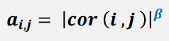
The power term, β, amplifies disparity between strong and weak correlations.
For example, with applying power term β = 4, the disparity between the pairwise comparison can be raised from 4-fold to 256-fold difference.

In order to select a suitable power term, run the following script to get the performance of a range of power, and then pick the lowest possible β that leads to approximately scale-free network topology. It indicates that the network topology having fewer nodes with many connections ("hubs") and many nodes with few connections.
Why use scale-free network topology?
 In brief, it is to build a biologically "realistic" network in WGCNA.
# Choose a set of soft-thresholding powers
powers = c(c(1:10), seq(from = 12, to=20, by=2))
# Call the network topology analysis function
sft = pickSoftThreshold(datExpr0, powerVector = powers, verbose = 5)
# Plot the results:
sizeGrWindow(9, 5)
par(mfrow = c(1,2));
cex1 = 0.6;
# Scale-free topology fit index as a function of the soft-thresholding power
plot(sft$fitIndices[,1], -sign(sft$fitIndices[,3])*sft$fitIndices[,2],
xlab="Soft Threshold (power)",ylab="Scale Free Topology Model Fit,signed R^2",type="n",
main = paste("Scale independence"));
text(sft$fitIndices[,1], -sign(sft$fitIndices[,3])*sft$fitIndices[,2],
labels=powers,cex=cex1,col="red");
# this line corresponds to using an R^2 cut-off of h
abline(h= - 0.40,col="red")
# Mean connectivity as a function of the soft-thresholding power
plot(sft$fitIndices[,1], sft$fitIndices[,5],
xlab="Soft Threshold (power)",ylab="Mean Connectivity", type="n",
main = paste("Mean connectivity"))
text(sft$fitIndices[,1], sft$fitIndices[,5], labels=powers, cex=cex1,col="red")

This step requires the selection of network type of your choice. There are three types of network:
a. Unsigned network (default)
- No differentiation between positive and negative correlations. Use this if negative correlation are of interest.
b. Signed hybrid network
- Only positive correlations are taken into account. Negative correlations are set to 0. Use this if negative correlations are not of interest.
c. Signed network
- Use as an alternative to the signed hybrid network
Dynamic tree cut algorithm groups genes into modules, without mentioning the correlation method, the default is corFnc = "pearson".
###use function to identify modules
bwnet = blockwiseModules(datExpr0, maxBlockSize = 5000,
power = 8, TOMType = "unsigned", minModuleSize = 30,
reassignThreshold = 0, mergeCutHeight = 0.25,
numericLabels = TRUE,
saveTOMs = TRUE,
saveTOMFileBase = "FEMP_TOM-blockwise",
verbose = 3)
# check number of modules
table(bwnet$colors)
1 2 3 4 5 6 7
4170 1762 1632 1491 617 188 140
This indicates there are 7 modules, labeled 1 through 7.
##Plot the identified modules
# open a graphics window
sizeGrWindow(12, 9)
# Convert labels to colors for plotting
mergedColors = labels2colors(bwnet$colors)
# Plot the dendrogram and the module colors underneath
plotDendroAndColors(bwnet$dendrograms[[1]], mergedColors[bwnet$blockGenes[[1]]],
"Module colors",
dendroLabels = FALSE, hang = 0.03,
addGuide = TRUE, guideHang = 0.05)


At this stage, you might still have no idea how we can utilise the analysed data. In fact, the clustering process is very useful for obtaining module eigengene, which is the most highly connected intramodular hub gene. In my case above, I have the gene clustered into 7 groups, the next step that I would perform is to relate the modules to other information, such as clinical traits as given by the tutorial (which is not relevant for my plant dataset) or genetic variation or annotation results.
3. Correlation of modules with external traits and identification of potential "driver" genes
The first part of this step involves computing of dissimilarity between genes. Before that, the function TOM (topological overlap measure) is a pairwise similarity measure between network nodes (genes). Mathematically, TOM(i, j) is high if genes i, j have many shared neighbours (which mean the overlapping of their network neighbours is large). A high TOM(i, j) implies that the genes have similar expression patterns. To obtain the dissimilarity measure, we transformed TOM value (similarity value) into dissimilarity value by input the code distTOM = 1 - TOM
#get all the module labels
moduleLabels = bwnet$colors
#get all the module colors
moduleColors = labels2colors(bwnet$colors)
#get all the MEs important for next analysis
MEs = bwnet$MEs;
###plot coexpression network in heatmap
geneTree = bwnet$dendrograms[[1]];
# Calculate topological overlap anew: this could be done more efficiently by saving the TOM
# calculated during module detection, but let us do it again here.
dissTOM = 1-TOMsimilarityFromExpr(datExpr0, power = 8);
# Transform dissTOM with a power to make moderately strong connections more visible in the heatmap
plotTOM = dissTOM^7;
# Set diagonal to NA for a nicer plot
diag(plotTOM) = NA;
# Call the plot function
sizeGrWindow(9,9)
TOMplot(plotTOM, geneTree, moduleColors, main = "Network heatmap plot, 10,000 FEMP DEGs")
nGenes = ncol(datExpr0)
nSamples = nrow(datExpr0)
nSelect = 400
# For reproducibility, we set the random seed
set.seed(10);
select = sample(nGenes, size = nSelect);
selectTOM = dissTOM[select, select];
# There's no simple way of restricting a clustering tree to a subset of genes, so we must re-cluster.
selectTree = hclust(as.dist(selectTOM), method = "average")
selectColors = moduleColors[select];
# Open a graphical window
sizeGrWindow(9,9)
# Taking the dissimilarity to a power, say 10, makes the plot more informative by effectively changing
# the color palette; setting the diagonal to NA also improves the clarity of the plot
plotDiss = selectTOM^7;
diag(plotDiss) = NA;
TOMplot(plotDiss, selectTree, selectColors, main = "Network heatmap plot, selected genes")

4. Visualise the network
Cytoscape is an open source software platform for visualising molecular interaction networks and biological pathways and integrating these networks with annotation, gene expression profiles and other state data. You can download the software from the official website, https://cytoscape.org/.
######Export to cytoscape
# Recalculate topological overlap if needed
TOM = TOMsimilarityFromExpr(datExpr0, power = 8);
# Read in the annotation file
annot = read.csv("Geneannot_AllDEG_FEMP.csv");
# Select modules
modules = c("turquoise", "blue");
# Select module probes
Transcript = names(datExpr0)
inModule = is.finite(match(moduleColors, modules));
modProbes = Transcript[inModule];
modGenes = annot$SwissprotID[match(modProbes, annot$ï..gene_id)];
# Select the corresponding Topological Overlap
modTOM = TOM[inModule, inModule];
dimnames(modTOM) = list(modProbes, modProbes)
# Export the network into edge and node list files Cytoscape can read
cyt = exportNetworkToCytoscape(modTOM,
edgeFile = paste("CytoscapeInput-edges-", paste(modules, collapse="-"), ".txt", sep=""),
nodeFile = paste("CytoscapeInput-nodes-", paste(modules, collapse="-"), ".txt", sep=""),
weighted = TRUE,
threshold = 0.02,
nodeNames = modProbes,
altNodeNames = modGenes,
nodeAttr = moduleColors[inModule])

This is the simplest form of gene-gene network
While we can observe there are several groups of genes, we want to find a way to cluster them, in this example (below), the genes could be clustered into 3 main groups.


What's more, we could identify the "driver" gene in each cluster based on the correlation measurement.

All these could be done by WGCNA analysis.
WGCNA is a type of analysis that used to correlate disparate data sets, such as SNPs, gene expression, DNA methylation, clinical outcomes etc. The central hypothesis of WGCNA is "genes with similar expression patterns are of interest because they may be tightly co-regulated, functionally related and members of the same pathway".
Before creating a WGCNA network, one has to create the modules (same definition as "cluster") for the dataset. This can be done by running a clustering analysis on the normalised dataset, often the combination methods using average linkage hierarchical clustering coupled with the topological overlap dissimilarity measure. Modules are defined as branches based on the resulting cluster tree (using dynamic tree cutting method), which either labelled by integers (1,2,3...) or equivalently by colors (turqoise, blue, brown, etc).
Okay, these seems too much of jargonised terms. But firstly, we could divide the workflow into 4 parts:
1. Data preparation
2. Weighted correlation network of genes
- Selection of soft thresholding power and module detection
3. Correlation of modules with external traits and identification of potential "driver" genes
4. Visualise the network
R script explanation:
1. Data preparation
####Set directory
getwd() #to know what is your current working directory
workingDir = "C:/Users/Lynn/Documents/WGCNA" #set this as your working directory
setwd(workingDir) #run the code "setwd" to direct R studio into this working environment
####load the library
####Automatic installation from CRAN
#install.packages("BiocManager")
#BiocManager::install("WGCNA")
library(WGCNA)# The following setting is important, do not omit.
options(stringsAsFactors = FALSE);
####Read sample data in its file format
FEMP_geneexp = read.csv("AllGene_FEMP.csv")
dim(FEMP_geneexp) #check data dimensions
[1] 92026 16
####Prepare dataframe to extract expression data
##I have the dataset with more than 90k of input genes for 8 samples. To ease the analysis, I only run the analysis for the top 10k of expressed genes.
order(FEMP_geneexp, decreasing = TRUE) #arrange the expression dataset in descending order
FEMP_geneexp <- FEMP_geneexp[1:10000,] #choose only the first 10k row
datExpr0 = as.data.frame(t(FEMP_geneexp[,-c(1,10:16)])) #choose the target columns for this analysis, remember to transpose the dataframe to make the rows as the samples and the columns as the 10k of gene list.
names(datExpr0) = FEMP_geneexp$ï..gene_id; #name the 10k of gene list, before this step, the first row of the dataframe is just labelled as 1,2,3...but now they are with the unique ID from the original csv file.
rownames(datExpr0) = names(FEMP_geneexp)[-c(1,10:16)]; #trim the dataframe so that it contain only the rows with integer only.
####normalise the dataframe
datExpr0 <- scale(datExpr0) #scale function is very useful to change the integar ranged from 0 to 1.
##Check if there are genes with missing values
gsg = goodSamplesGenes(datExpr0, verbose = 3);
gsg$allOK #if this return TRUE, all genes have passed the cuts. If not, we remove the offending genes and samples from the data
if (!gsg$allOK)
{
# Optionally, print the gene and sample names that were removed:
if (sum(!gsg$goodGenes)>0)
printFlush(paste("Removing genes:", paste(names(datExpr0)[!gsg$goodGenes], collapse = ", ")));
if (sum(!gsg$goodSamples)>0)
printFlush(paste("Removing samples:", paste(rownames(datExpr0)[!gsg$goodSamples], collapse = ", ")));
# Remove the offending genes and samples from the data:
datExpr0 = datExpr0[gsg$goodSamples, gsg$goodGenes]
}
####Sample clustering
####cluster the samples to see if there are any obvious outliers
sampleTree = hclust(dist(datExpr0), method = "average");
# Plot the sample tree: Open a graphic output window of size 12 by 9 inches
# The user should change the dimensions if the window is too large or too small.
sizeGrWindow(12,9)
#pdf(file = "Plots/sampleClustering.pdf", width = 12, height = 9);
par(cex = 0.6);
par(mar = c(0,4,2,0))
plot(sampleTree, main = "Sample clustering to detect outliers", sub="", xlab="", cex.lab = 1.5,
cex.axis = 1.5, cex.main = 2)

#####Remove outliers from data (but I have skipped this part because obviously no outlier. If you need to perform this step, you can modify the following script for your own case)
##### Plot a line to show the cut
abline(h = 15, col = "red");
##### Determine cluster under the line
clust = cutreeStatic(sampleTree, cutHeight = 15, minSize = 10)
table(clust)
##### clust 1 contains the samples we want to keep
keepSamples = (clust==1)
datExpr = datExpr0[keepSamples, ]
nGenes = ncol(datExpr)
nSamples = nrow(datExpr)
- Selection of soft thresholding power and module detection
This is the first important analysis in WGCNA.
The distance between the genes are calculated using several types of correlation method suitable for different dataset:
a. Pearson - cor(x)
- Default correlation method in WGCNA, use it when there is no outliers
- Fastest, but sensitive to outliers
- It is also a standard measurement of linear correlation
b. Spearman, Kendall - cor(x, method = "spearman")
- Rank-based, works even if the relationship is not linear
- Less sensitive to gene expression differences
- Can be used as-is for correlations involving binary/categorical variables
c. biweight midcorrelation - bicor(x)
- Robust
For every pair of genes (i, j), the function compute a correlation raised to a power between them, to calculate their adjacencies.
The power term, β, amplifies disparity between strong and weak correlations.
For example, with applying power term β = 4, the disparity between the pairwise comparison can be raised from 4-fold to 256-fold difference.

In order to select a suitable power term, run the following script to get the performance of a range of power, and then pick the lowest possible β that leads to approximately scale-free network topology. It indicates that the network topology having fewer nodes with many connections ("hubs") and many nodes with few connections.
Why use scale-free network topology?

# Choose a set of soft-thresholding powers
powers = c(c(1:10), seq(from = 12, to=20, by=2))
# Call the network topology analysis function
sft = pickSoftThreshold(datExpr0, powerVector = powers, verbose = 5)
# Plot the results:
sizeGrWindow(9, 5)
par(mfrow = c(1,2));
cex1 = 0.6;
# Scale-free topology fit index as a function of the soft-thresholding power
plot(sft$fitIndices[,1], -sign(sft$fitIndices[,3])*sft$fitIndices[,2],
xlab="Soft Threshold (power)",ylab="Scale Free Topology Model Fit,signed R^2",type="n",
main = paste("Scale independence"));
text(sft$fitIndices[,1], -sign(sft$fitIndices[,3])*sft$fitIndices[,2],
labels=powers,cex=cex1,col="red");
# this line corresponds to using an R^2 cut-off of h
abline(h= - 0.40,col="red")
# Mean connectivity as a function of the soft-thresholding power
plot(sft$fitIndices[,1], sft$fitIndices[,5],
xlab="Soft Threshold (power)",ylab="Mean Connectivity", type="n",
main = paste("Mean connectivity"))
text(sft$fitIndices[,1], sft$fitIndices[,5], labels=powers, cex=cex1,col="red")

It's not as beautiful as the tutorial, the left plot usually shows an increasing trend and reach plateau after particular power. We have to choose the lowest possible power term where topology approximately fits a scale-free network. In the right plot, it shows that the connectivity drops as power goes up. The power that we choose should not make the connectivity to drop too low. anyway I choose power of 8, reaching threshold r^2 > - 0.4
This step requires the selection of network type of your choice. There are three types of network:
a. Unsigned network (default)
- No differentiation between positive and negative correlations. Use this if negative correlation are of interest.
b. Signed hybrid network
- Only positive correlations are taken into account. Negative correlations are set to 0. Use this if negative correlations are not of interest.
c. Signed network
- Use as an alternative to the signed hybrid network
Dynamic tree cut algorithm groups genes into modules, without mentioning the correlation method, the default is corFnc = "pearson".
###use function to identify modules
bwnet = blockwiseModules(datExpr0, maxBlockSize = 5000,
power = 8, TOMType = "unsigned", minModuleSize = 30,
reassignThreshold = 0, mergeCutHeight = 0.25,
numericLabels = TRUE,
saveTOMs = TRUE,
saveTOMFileBase = "FEMP_TOM-blockwise",
verbose = 3)
# check number of modules
table(bwnet$colors)
1 2 3 4 5 6 7
4170 1762 1632 1491 617 188 140
This indicates there are 7 modules, labeled 1 through 7.
##Plot the identified modules
# open a graphics window
sizeGrWindow(12, 9)
# Convert labels to colors for plotting
mergedColors = labels2colors(bwnet$colors)
# Plot the dendrogram and the module colors underneath
plotDendroAndColors(bwnet$dendrograms[[1]], mergedColors[bwnet$blockGenes[[1]]],
"Module colors",
dendroLabels = FALSE, hang = 0.03,
addGuide = TRUE, guideHang = 0.05)


module = branch of a cluster tree
Each module is indicated by different colors
For my dataset, it generates 3 blocks. In general, it is preferable to analyze a data set with as fewer blocks as possible. We can reduce the block size by adjusting the maxBlockSize parameter, making it to a higher number. This parameter tells the functions of how large the largest block can be that the reader's computer can handle. As seen in the online tutorial, the default maxBlockSize = 5000 is appropriate for most modern desktops equipped with 4 GB of memory (However, my laptop has only around 2GB free memory, so I reduced it to 2000).
At this stage, you might still have no idea how we can utilise the analysed data. In fact, the clustering process is very useful for obtaining module eigengene, which is the most highly connected intramodular hub gene. In my case above, I have the gene clustered into 7 groups, the next step that I would perform is to relate the modules to other information, such as clinical traits as given by the tutorial (which is not relevant for my plant dataset) or genetic variation or annotation results.
3. Correlation of modules with external traits and identification of potential "driver" genes
The first part of this step involves computing of dissimilarity between genes. Before that, the function TOM (topological overlap measure) is a pairwise similarity measure between network nodes (genes). Mathematically, TOM(i, j) is high if genes i, j have many shared neighbours (which mean the overlapping of their network neighbours is large). A high TOM(i, j) implies that the genes have similar expression patterns. To obtain the dissimilarity measure, we transformed TOM value (similarity value) into dissimilarity value by input the code distTOM = 1 - TOM
#get all the module labels
moduleLabels = bwnet$colors
#get all the module colors
moduleColors = labels2colors(bwnet$colors)
#get all the MEs important for next analysis
MEs = bwnet$MEs;
###plot coexpression network in heatmap
geneTree = bwnet$dendrograms[[1]];
# Calculate topological overlap anew: this could be done more efficiently by saving the TOM
# calculated during module detection, but let us do it again here.
dissTOM = 1-TOMsimilarityFromExpr(datExpr0, power = 8);
# Transform dissTOM with a power to make moderately strong connections more visible in the heatmap
plotTOM = dissTOM^7;
# Set diagonal to NA for a nicer plot
diag(plotTOM) = NA;
# Call the plot function
sizeGrWindow(9,9)
TOMplot(plotTOM, geneTree, moduleColors, main = "Network heatmap plot, 10,000 FEMP DEGs")
nGenes = ncol(datExpr0)
nSamples = nrow(datExpr0)
nSelect = 400
# For reproducibility, we set the random seed
set.seed(10);
select = sample(nGenes, size = nSelect);
selectTOM = dissTOM[select, select];
# There's no simple way of restricting a clustering tree to a subset of genes, so we must re-cluster.
selectTree = hclust(as.dist(selectTOM), method = "average")
selectColors = moduleColors[select];
# Open a graphical window
sizeGrWindow(9,9)
# Taking the dissimilarity to a power, say 10, makes the plot more informative by effectively changing
# the color palette; setting the diagonal to NA also improves the clarity of the plot
plotDiss = selectTOM^7;
diag(plotDiss) = NA;
TOMplot(plotDiss, selectTree, selectColors, main = "Network heatmap plot, selected genes")

4. Visualise the network
Cytoscape is an open source software platform for visualising molecular interaction networks and biological pathways and integrating these networks with annotation, gene expression profiles and other state data. You can download the software from the official website, https://cytoscape.org/.
######Export to cytoscape
# Recalculate topological overlap if needed
TOM = TOMsimilarityFromExpr(datExpr0, power = 8);
# Read in the annotation file
annot = read.csv("Geneannot_AllDEG_FEMP.csv");
# Select modules
modules = c("turquoise", "blue");
# Select module probes
Transcript = names(datExpr0)
inModule = is.finite(match(moduleColors, modules));
modProbes = Transcript[inModule];
modGenes = annot$SwissprotID[match(modProbes, annot$ï..gene_id)];
# Select the corresponding Topological Overlap
modTOM = TOM[inModule, inModule];
dimnames(modTOM) = list(modProbes, modProbes)
# Export the network into edge and node list files Cytoscape can read
cyt = exportNetworkToCytoscape(modTOM,
edgeFile = paste("CytoscapeInput-edges-", paste(modules, collapse="-"), ".txt", sep=""),
nodeFile = paste("CytoscapeInput-nodes-", paste(modules, collapse="-"), ".txt", sep=""),
weighted = TRUE,
threshold = 0.02,
nodeNames = modProbes,
altNodeNames = modGenes,
nodeAttr = moduleColors[inModule])
With the modules and network built by WGCNA, we can flexibly continue the analysis on the sub-clusters of the networks or focus on the study of certain hub genes in the network.
References:
https://edu.isb-sib.ch/pluginfile.php/158/course/section/65/_01_SIB2016_wgcna.pdf
Comments
Post a Comment