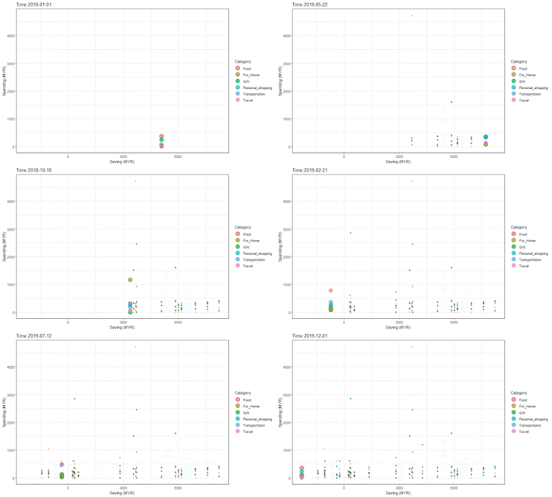
It is very fun to play around with this gganimate package. This is considered a very simple tool to add the fancy animation effect to a diagram. I first came to know about these fascinating graphs from a presentation of world-famous statistician Hans Rosling in a TED video (I wow to discover that it was a 13 years old video!).
I was inspired by the article written by Dr Keith McNulty. After trying out his tutorial, I wanted to make an animated graphic for my spending record to get more learning of the package.
I have been keeping a habit to record my spending in Excel, divided them into six categories: food, travel, personal (whatever counted as my shopping expense), home (things I bought for my family), gift (things that I bought for friends), and transportation (fuels, Toll, or public transportation expenses). The expenses were counted in MYR (Malaysia Ringgit) and summarised monthly. I have modified all the amounts for the exercise.
Below is a glance of the data (from 2018 to 2019) in the CSV file format.
head(spending2019)
> ï..Year Month Time Category MYR Saving
1 2019 Jan 1/1/2019 Food 197.55 561.37
2 2019 Feb 1/2/2019 Food 181.88 311.40
3 2019 Mar 1/3/2019 Food 172.20 -1078.07
4 2019 Apr 1/4/2019 Food 210.05 269.34
5 2019 May 1/5/2019 Food 235.69 241.11
6 2019 Jun 1/6/2019 Food 161.65 -1423.08
R script:
library(ggplot2)
library(gganimate)
theme_set(theme_bw())
library(gapminder)
library(gifski)
spending2019 <- read.csv("C:/Users/Lynn/Documents/Spending2019.csv")
p <- ggplot(
spending2019,
aes(x = Saving, y= MYR, size = MYR, colour = Category)
) +
geom_point(aes(color = Category, fill = Category), shape = 21, show.legend = TRUE, alpha = 0.7, size = 5, stroke = 1) +
scale_color_viridis_d() +
labs(x = "Saving (MYR)", y = "Spending (MYR)")
p
anim <- p + facet_wrap(~Category) +
transition_time(as.Date(spending2019$Time,format = "%d/%m/%Y")) + labs(title = "Time:{frame_time}") +
shadow_mark(alpha = 1, size = 1)
animate(anim, fps = 5, width = 750, height = 450)
anim_save("Spending_P1.gif")
#####################create facets by categoryanim <- p + facet_wrap(~Category) + transition_time(as.Date(spending2019$Time,format = "%d/%m/%Y")) + labs(title = "Time:{frame_time}") + shadow_mark(alpha = 1, size = 1)
animate(anim, fps = 5, width = 750, height = 450)anim_save("Spending_P2.gif")
 |
| P1 in GIF |
 |
| P2 in GIF |
I'm pretty satisfied with the illustration P2 (the second GIF above), which clearly shows that the spending on food was very consistent throughout the year 2018 to 2019, and it is similarly stable for category Gift. However, the shopping and travel expenses were obviously spiked spontaneously and impulsively, mostly due to the poor financial monitoring of the person. XD From the chart above, one can observe that in the earlier year (2018) this person tends to save more money, but for 2019 errrr.... haha.
Stay curious and have fun.
Comments
Post a Comment